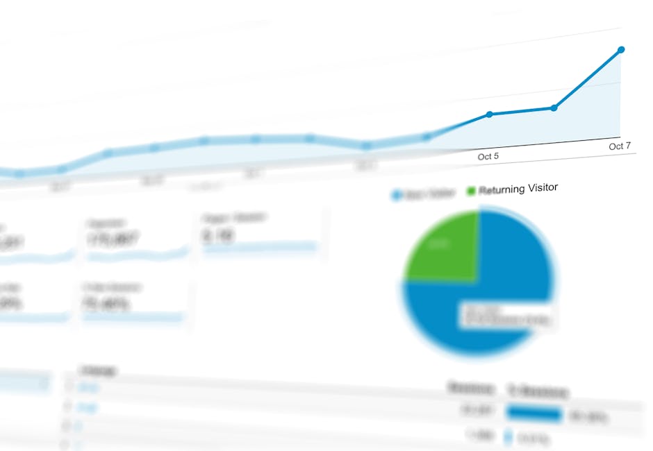
A real-time KwickOS reporting dashboard surfacing sales, labor, and product-mix data simultaneously.
A restaurant with no reporting is a restaurant flying blind. You might sense that Friday nights are busy, that one server always upsells desserts, and that chicken wings disappear faster than expected — but sensing is not the same as knowing. Knowing lets you act. Sensing just lets you worry.
Modern cloud POS systems generate hundreds of data points every single shift. The difference between struggling operators and thriving ones is not the volume of data they collect — it's the quality and timeliness of the reports they read. This guide breaks down every category of POS reporting your restaurant needs, explains what each report reveals, and shows how KwickOS packages them all into a single, intuitive analytics suite accessible from any device.
Why POS Reporting Is Not Optional in 2026
Thin restaurant margins — typically 3 to 9 percent — leave almost no room for error. Labor costs, food waste, and theft can each silently erode profitability without triggering any obvious alarm. Manual tracking in spreadsheets catches problems weeks or months after the damage is done. POS-driven reporting catches them the same day, sometimes the same hour.
Beyond cost control, reporting drives revenue. When you can see which menu items have the highest profit margin AND the highest popularity, you know exactly what to promote. When you can compare server-by-server average check values, you know who to coach and who to reward. When you can overlay foot traffic against historical weather or local events, you schedule exactly the right number of people for every shift.
A 2025 National Restaurant Association study found that operators using real-time POS analytics were 2.3x more likely to achieve double-digit revenue growth year-over-year compared to those relying on end-of-week manual reporting.
The challenge has historically been complexity. Legacy POS systems buried reports inside opaque menus, exported only to CSV, and required dedicated staff to interpret. That era is over. KwickOS delivers restaurant reporting that is visual, contextual, and instantly shareable — designed for owners who run restaurants, not for data scientists.
Category 1 — Sales Reports
Sales reports are the heartbeat of your operation. They tell you how much money moved through your restaurant, where it came from, when it arrived, and how it compares to prior periods. Every restaurant, regardless of size or concept, should review these daily.
| # | Report Name | What It Shows | Frequency |
|---|---|---|---|
| 1 | Daily Sales Summary | Total revenue, transaction count, average check, voids, discounts, and tax by day | Daily |
| 2 | Weekly Sales Trend | Day-by-day sales stacked across the past 4–8 weeks to identify seasonal momentum | Weekly |
| 3 | Monthly Revenue Comparison | Current month vs. prior month and prior year, with variance percentage | Monthly |
| 4 | Revenue by Channel | Dine-in, takeout, delivery, catering, and drive-through revenue in one view | Daily |
| 5 | Revenue by Daypart | Breakfast, brunch, lunch, dinner, and late-night slices of daily revenue | Daily |
| 6 | Table Turn Rate | Average covers per table per shift, total seat occupancy rate | Weekly |
| 7 | Discount & Void Analysis | Who applied discounts, void reasons, frequency, and dollar impact | Daily |
Reading Your Daily Sales Summary
The Daily Sales Summary should be the first thing you review every morning. In KwickOS, this report auto-emails to ownership at a configurable time (default: 7:00 AM). It flags anomalies automatically — if last Tuesday's sales were $4,200 and today's are $1,900, the system highlights the variance in red. You don't have to hunt for the problem; the report surfaces it.
Pay special attention to the void rate. Industry average is under 1.5 percent of transactions. A spike above that signals either a training issue (servers entering wrong orders) or an integrity problem (unauthorized refunds). KwickOS captures the employee ID behind every void, so investigation takes seconds.
Category 2 — Hourly Traffic and Trend Reports
Knowing how much you sold by day is useful. Knowing what happened hour by hour is transformational — because staffing, prep, and inventory purchasing all happen at the hourly level. Over-staffing the 2–5 PM dead zone and under-staffing the 6–8 PM rush is one of the most expensive and most preventable mistakes in restaurant operations.
Hourly Sales Heat Map
Color-coded grid showing transaction volume by hour across all days of the week. Instantly reveals your peak and dead zones.
Guest Count by Hour
Covers served per 30-minute interval. Essential for matching server sections to demand curves.
Average Ticket by Hour
Shows whether guests spend more at lunch vs. dinner and which hours drive dessert or beverage attachment.
Day-of-Week Comparison
Compares the same day across 4, 8, or 13 weeks, filtering out anomalies like holidays and special events.
Kitchen Throughput by Hour
Ticket times, item counts fired, and ticket completion rate — so you can pinpoint where the kitchen bogs down.
Reservation vs. Walk-in Split
How much of your revenue came from planned covers vs. spontaneous guests, by hour and day.
KwickOS overlays historical weather data and local event calendars onto hourly trend reports automatically. If a home game drives a 40% traffic spike every other Thursday, that context appears directly in the chart — so scheduling decisions are made with full situational awareness.
Category 3 — Product Mix and Menu Performance Reports
Your menu is your product catalogue. A product mix report — sometimes called a "pmix" — tells you exactly which items are selling, which are stagnating, and which are dragging down your kitchen's efficiency. Combined with cost data, pmix analysis is arguably the single most powerful lever for improving restaurant profitability.
| # | Report Name | Key Metric | Action It Enables |
|---|---|---|---|
| 8 | Product Mix Summary | Units sold, revenue, % of total sales by item | Identify top sellers to promote and weak items to cut |
| 9 | Menu Engineering Matrix | Profit margin vs. popularity plotted as Stars, Plowhorses, Puzzles, Dogs | Guide menu redesign and pricing strategy |
| 10 | Category Performance | Revenue and margin by category (appetizers, entrees, desserts, beverages) | Rebalance menu mix toward high-margin categories |
| 11 | Modifier Attachment Rate | % of base items sold with add-ons (extra protein, premium substitutions) | Train servers to suggest high-value modifiers |
| 12 | Item-Level Food Cost % | Actual ingredient cost vs. sale price for each menu item | Flag items where cost % exceeds target (typically 28–32%) |
| 13 | Item Velocity by Daypart | Which items sell fastest at breakfast, lunch, and dinner | Optimize prep quantities and reduce waste |
| 14 | LTO / Specials Performance | Sales volume, margin, and reorder rate for limited-time offerings | Decide whether to graduate specials to the permanent menu |
The Menu Engineering Matrix in Practice
KwickOS automatically classifies every menu item into one of four quadrants based on trailing 30-day data. Stars are high-popularity, high-margin items — your superstars that should receive the most menu real estate and server recommendation emphasis. Plowhorses sell well but at thin margins — candidates for a subtle price increase or ingredient substitution to improve the margin. Puzzles are high-margin but low-volume — they need better placement, better description, or better photography. Dogs do neither well and should be removed at the next menu refresh.
Most operators find that 20 to 30 percent of their menu falls into the Dog category and is actively draining kitchen bandwidth. Eliminating those items reduces prep complexity, speeds up service, and typically increases overall margin by 2 to 4 percentage points.
Category 4 — Food Cost and Inventory Reports
Food cost is the most manipulable line on your P&L — for better and for worse. Operators who track it precisely can optimize purchasing, reduce waste, and catch theft. Those who don't routinely discover they've been running 38% food cost when their target was 30%, and they have no idea when the problem started.
| # | Report Name | What It Reveals | Priority |
|---|---|---|---|
| 15 | Theoretical vs. Actual Food Cost | Gap between what you should have used (based on sales) and what you actually used (based on inventory) | Critical |
| 16 | Waste & Spoilage Log | Items discarded, weight/quantity, reason code, and dollar value by station | Critical |
| 17 | Variance Report by Category | Over/under usage vs. recipe standard for protein, produce, dairy, dry goods | High |
| 18 | Purchase vs. Usage Reconciliation | Verifies that everything received from suppliers is accounted for in sales or waste | High |
| 19 | Low Stock Alerts | Real-time notification when an ingredient falls below par level | Critical |
| 20 | Supplier Price Variance | Flags when invoice prices deviate from contracted pricing by item | Medium |
A casual-dining group using KwickOS's theoretical vs. actual food cost report discovered a 6.2% variance in their burger protein line — equivalent to $11,400 in unaccounted product per quarter. The root cause: portion weights had drifted from 6 oz to 7.5 oz without a recipe update. Fixed within one week of identifying the report.
Category 5 — Labor Reports
Labor is typically the largest single controllable cost in a restaurant, often representing 28 to 35 percent of revenue. The challenge is that labor is also highly perishable — you cannot "inventory" labor hours the way you can inventory food. Once a scheduled shift is on the clock, the cost is committed. This makes proactive labor reporting — not reactive payroll analysis — essential.
Labor Cost % by Shift
Real-time labor cost as a percentage of sales for the current shift, compared to target and prior-period average.
Labor Cost by Role
Breaks down labor spend by FOH, BOH, management, and support staff — revealing where overages are occurring.
Overtime Alert Report
Flags employees approaching 40 hours mid-week so managers can proactively adjust schedules before overtime kicks in.
Sales per Labor Hour
The gold-standard labor efficiency metric: revenue generated for every hour of labor clocked.
Clock-In vs. Schedule Variance
Shows early clock-ins, late arrivals, unauthorized break extensions, and buddy-punch risks.
Tip Distribution Report
Documents tip pooling, tip-out calculations, and cash vs. card tip splits for compliance documentation.
The Sales-Per-Labor-Hour Benchmark
Industry benchmarks for Sales per Labor Hour (SPLH) vary by concept: quick-service targets are typically $40–$60 SPLH; casual dining $25–$45; fine dining $35–$55. KwickOS displays your live SPLH on the manager dashboard so you can make real-time decisions — cutting a server section when the dining room empties, calling in extra line cooks when an unexpected rush hits, or sending home the third dishwasher at 9 PM.
| Report | Daily Use | Weekly Use | Payroll Use |
|---|---|---|---|
| Labor Cost % by Shift | Intra-shift decisions | Shift-type benchmarking | Period trend review |
| Overtime Alert | Mid-week schedule cuts | Weekly overtime budget tracking | OT cost audit |
| Sales per Labor Hour | Real-time efficiency | Section optimization | KPI reporting to ownership |
| Clock-In Variance | Unauthorized time review | Pattern detection | Payroll accuracy verification |
| Tip Distribution | Shift closeout | Staff trust monitoring | W-2 / tax compliance |
Category 6 — Server Performance Reports
Your servers are revenue generators, not just order takers. A server who averages $42 per check versus one who averages $35 per check at the same table size and daypart is generating materially more revenue per shift — and likely building better guest relationships that drive repeat visits. Server performance reports make this visible, fair, and actionable.
| # | Report Name | Key Metric | Use Case |
|---|---|---|---|
| 21 | Average Check by Server | Mean revenue per ticket, ranked across all servers | Identify top performers and coaching candidates |
| 22 | Upsell Rate by Server | % of tables that ordered appetizers, desserts, or premium beverages | Measure effectiveness of suggestive selling training |
| 23 | Covers per Hour by Server | Guests served per hour of floor time | Assess service efficiency and section management skills |
| 24 | Discount Usage by Server | Comp and discount total and frequency per employee | Detect unauthorized discounting or favor-giving |
| 25 | Tip % by Server | Average tip percentage received as a proxy for guest satisfaction | Guest experience quality indicator |
| 26 | Table Time by Server | Average seat-to-close time per table | Identify slow turnovers that reduce table capacity |
Use server performance reports to build positive recognition, not just corrective conversations. KwickOS lets you export a weekly "Server Leaderboard" that you can share with staff. Friendly competition around average check and upsell rate consistently lifts team-wide performance — without any change in menu or pricing.
Category 7 — Payment and Cash Handling Reports
Cash is the highest-risk element in any restaurant. Even with mostly card-paying guests, errors and theft in cash handling cost the average independent restaurant $15,000 to $40,000 per year according to the Association of Certified Fraud Examiners. POS payment reports create the audit trail that both prevents and detects these losses.
Cash Drawer Reconciliation
Actual drawer count vs. expected cash based on sales, with over/short flagged and attributed to the responsible employee.
Payment Method Breakdown
Credit, debit, cash, gift card, and third-party payment splits by shift and day.
Refund & Chargeback Report
Gift Card Liability Report
Outstanding gift card balances, redemption rates, and breakage revenue recognition.
Category 8 — Real-Time Dashboard
All the reports above are invaluable in retrospect. But the real-time dashboard is where management actually happens in the moment. KwickOS's live dashboard is designed to be displayed on a dedicated screen in the back office — a glance away from the floor — and summarizes everything a manager needs to run a shift without opening a single report.
What the KwickOS Real-Time Dashboard Shows
- Current sales pace — projected daily revenue based on current hour's run rate vs. target
- Tables open / seated / waiting — visual floor map with color-coded table status and timer
- Live labor cost % — updates every 15 minutes as staff clock in and out
- Kitchen ticket times — average and worst-case ticket time for the current hour
- Top-selling item this shift — useful for real-time 86 decisions
- Last 10 voids and discounts — employee, amount, and reason code at a glance
- Open credit card batches — ensures no unclosed batches at end of night
- Low inventory alerts — push notification when a tracked ingredient hits par
KwickOS supports multi-location real-time dashboards. If you operate three locations, a single screen shows all three side by side — with one-click drill-down to any individual site. Enterprise owners and district managers can monitor every location from a smartphone without calling anyone.
Category 9 — Customer and Loyalty Reports
Understanding who your guests are — not just what they ordered — is the final frontier of restaurant analytics. Loyalty-integrated POS systems like KwickOS tie every transaction to a guest profile, enabling marketing precision that was previously only available to large chains.
| # | Report Name | What It Reveals |
|---|---|---|
| 27 | New vs. Returning Guest Ratio | What % of covers are first-time vs. repeat guests; tracks retention rate over time |
| 28 | Guest Visit Frequency Distribution | How many guests visit 1x, 2–5x, 6–12x, or 12+ times per year |
| 29 | Loyalty Point Redemption Rate | % of earned points redeemed; high rates signal a valuable program, low rates signal disengagement |
| 30 | Customer Lifetime Value by Segment | Average annual revenue from guest segments defined by visit frequency and spend tier |
| 31 | Lapsed Guest Report | Identifies guests who haven't visited in 60+ days — triggers automated win-back offers |
| 32 | Online Review Correlation | Cross-references review timing with specific visit data to identify what drives 5-star reviews |
Building a Reporting Cadence That Actually Gets Used
Even the best reporting suite fails if it isn't reviewed consistently. The most successful KwickOS customers build a structured reporting cadence into their operations rhythm — treating reports like standing meetings that cannot be skipped.
Recommended Daily Reporting Routine (15 minutes)
- Review Daily Sales Summary email (auto-delivered at 7 AM)
- Check Void & Discount Report for any anomalies
- Review Cash Drawer Reconciliation from previous night's close
- Check Low Stock Alerts and update ordering if needed
- Glance at yesterday's hourly heat map to confirm staffing alignment
Weekly Reporting Review (30–45 minutes)
- Server Performance Leaderboard — recognize top performers, coach outliers
- Labor Cost % trend — compare week vs. prior week and vs. target
- Theoretical vs. Actual Food Cost — investigate any variance above 1%
- Product Mix Summary — note any item velocity shifts
- Revenue by Channel — is delivery growing? Is dine-in recovering?
Monthly Deep-Dive (2 hours)
- Menu Engineering Matrix — review and reclassify items, plan pricing or menu changes
- Customer Lifetime Value by Segment — evaluate loyalty program ROI
- Supplier Price Variance — audit invoice pricing against contracts
- Revenue vs. Prior Year — contextualize growth with commentary for ownership/investors
- Lapsed Guest Report — trigger win-back campaign for anyone >60 days absent
KwickOS can auto-generate and auto-email any report on any schedule to any email address or group. Many multi-unit operators configure weekly summaries to send directly to their accountant, GM, and district manager simultaneously — eliminating manual report preparation entirely.
How KwickOS Reporting Compares to Generic POS Systems
| Feature | KwickOS | Typical Legacy POS | Basic Cloud POS |
|---|---|---|---|
| Real-time dashboard | Included | Add-on cost | Limited |
| Menu engineering matrix | Automatic | Manual export | Not available |
| Multi-location view | Included | Separate system | Limited |
| Automated report emails | Fully configurable | No | Basic |
| Theoretical food cost | Built-in | Separate software | Not available |
| Offline reporting capability | Full offline mode | No | No |
| Server performance ranking | Automatic | Manual | Basic |
| Customer lifetime value | Integrated | CRM required | Not available |
Getting Started: Setting Up Reporting in KwickOS
Deploying the full KwickOS reporting suite is not a months-long IT project. Most restaurants are generating their first real-time reports within 48 hours of installation. Here is the recommended setup sequence:
- Import your menu — KwickOS accepts CSV, or your onboarding specialist builds it with you. This unlocks product mix and menu engineering reports immediately.
- Enter recipe costs — Input ingredient costs and recipe quantities for your top 20 items first. Theoretical food cost reports activate as soon as one recipe is costed.
- Connect inventory suppliers — KwickOS integrates with major broadline distributors for automated invoice import, enabling supplier price variance reports.
- Set labor targets — Configure your target labor cost percentage by shift type. The real-time dashboard uses this to color-code live labor performance.
- Configure report emails — Set up who receives what, and when. Recommend starting with Daily Sales Summary and Weekly Server Performance for the GM.
- Connect loyalty — Enable the loyalty module to begin accumulating guest profiles. Customer lifetime value reports become meaningful after 60 days of data.
Conclusion: Data Is Not Just for Chains Anymore
For decades, sophisticated restaurant analytics were the exclusive domain of large chains with dedicated data teams and enterprise software budgets. Independent operators made decisions based on gut feel, end-of-month P&L statements, and occasional spreadsheet work. That asymmetry gave chains a structural advantage that was almost impossible to overcome.
KwickOS eliminates that gap. The same reporting capabilities that a 500-location chain uses to optimize its operations are now available to a single-location diner, a three-unit taco concept, or a growing fast-casual group. Sales reports. Labor reports. Food cost reports. Server performance. Real-time dashboards. Customer analytics. All 30+ reports, all included, all designed to be read and acted on by an operator — not an analyst.
The restaurants that thrive in the next decade will not be the ones with the most instinct. They will be the ones with the clearest data, the fastest decisions, and the systems to execute. Start building that foundation today.